

I picked out collections that resonated with me, that I wanted to paint. Some of the collections were quite boring and didn’t inspire me, but I needed to consider which collection would be best suited to my chosen media. I listed my collections and thought which media and supports would work with each one and decided on the following.
White objects on a white back ground and icing sugar
Whilst mulling over what media to use for this collection, I made a quick sketch looking at the tonal range of the objects themselves and the cast shadows.


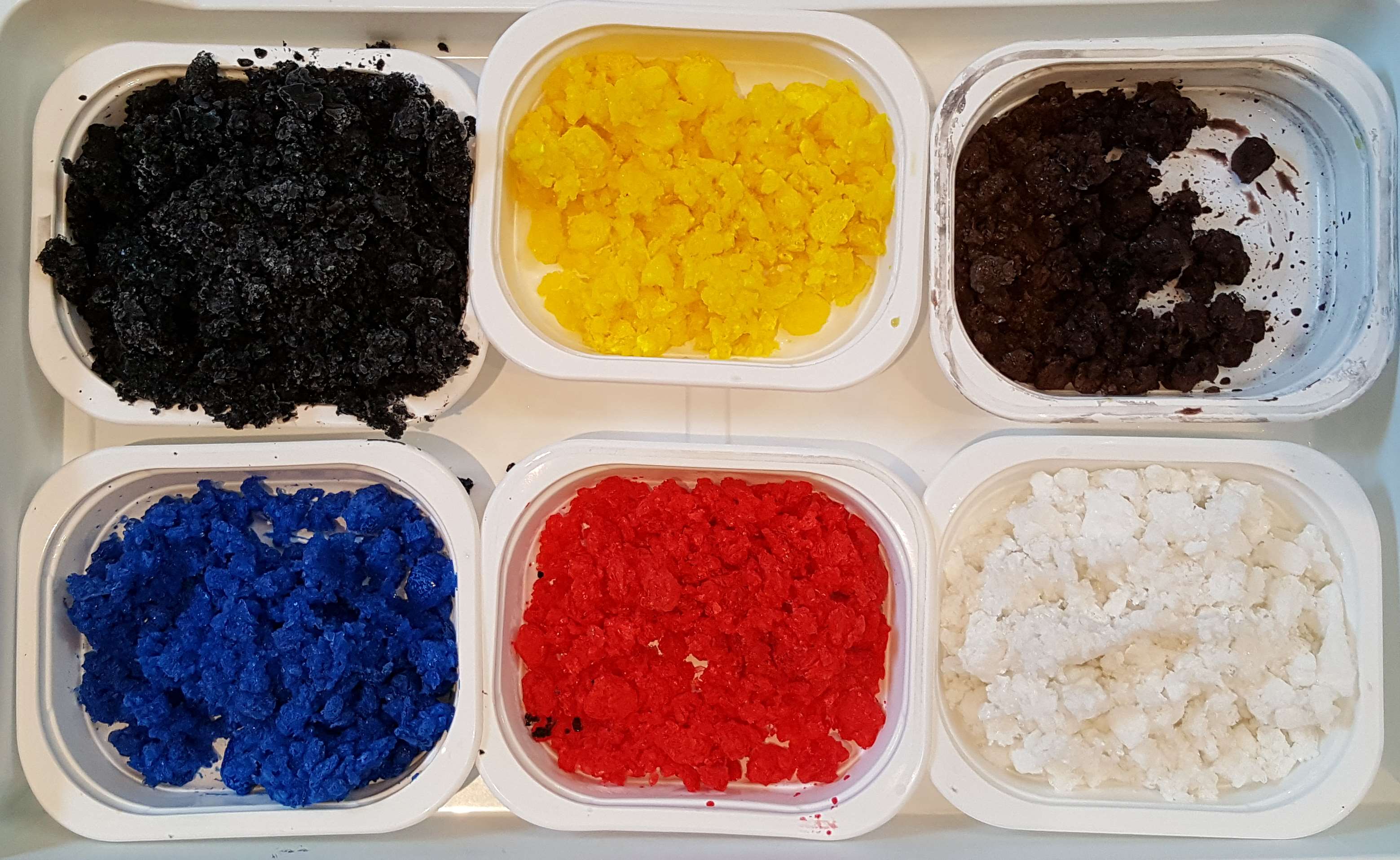
My idea for this painting was to use dry icing sugar, some mixed with ground charcoal to create a tone, and spray water over it to dissolve it. First, I made a few test swatches on acetate and paper to see how much charcoal to mix into the sugar and to see how the sprayed water reacted with it. The first test was on acetate. I laid two lines of sugar next to each other and sprayed with water. I was a bit heavy handed with the spray, but I really loved the effect.
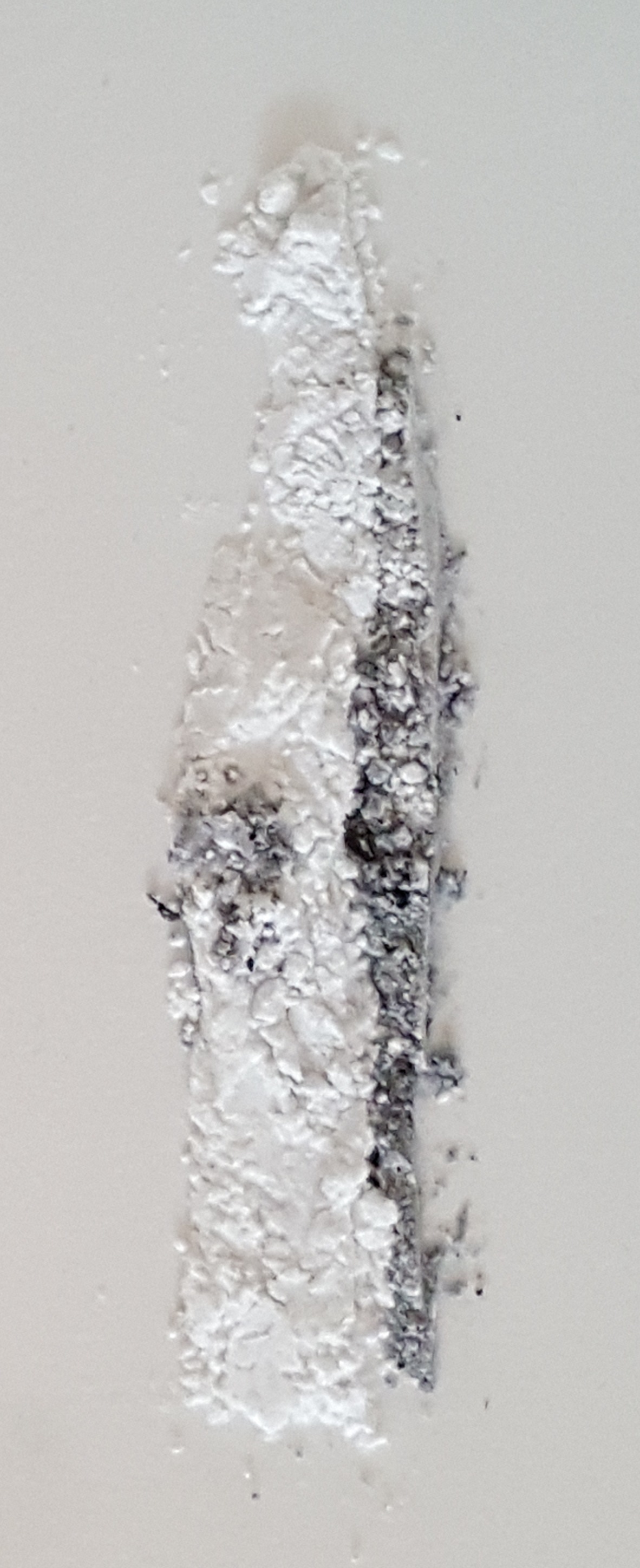
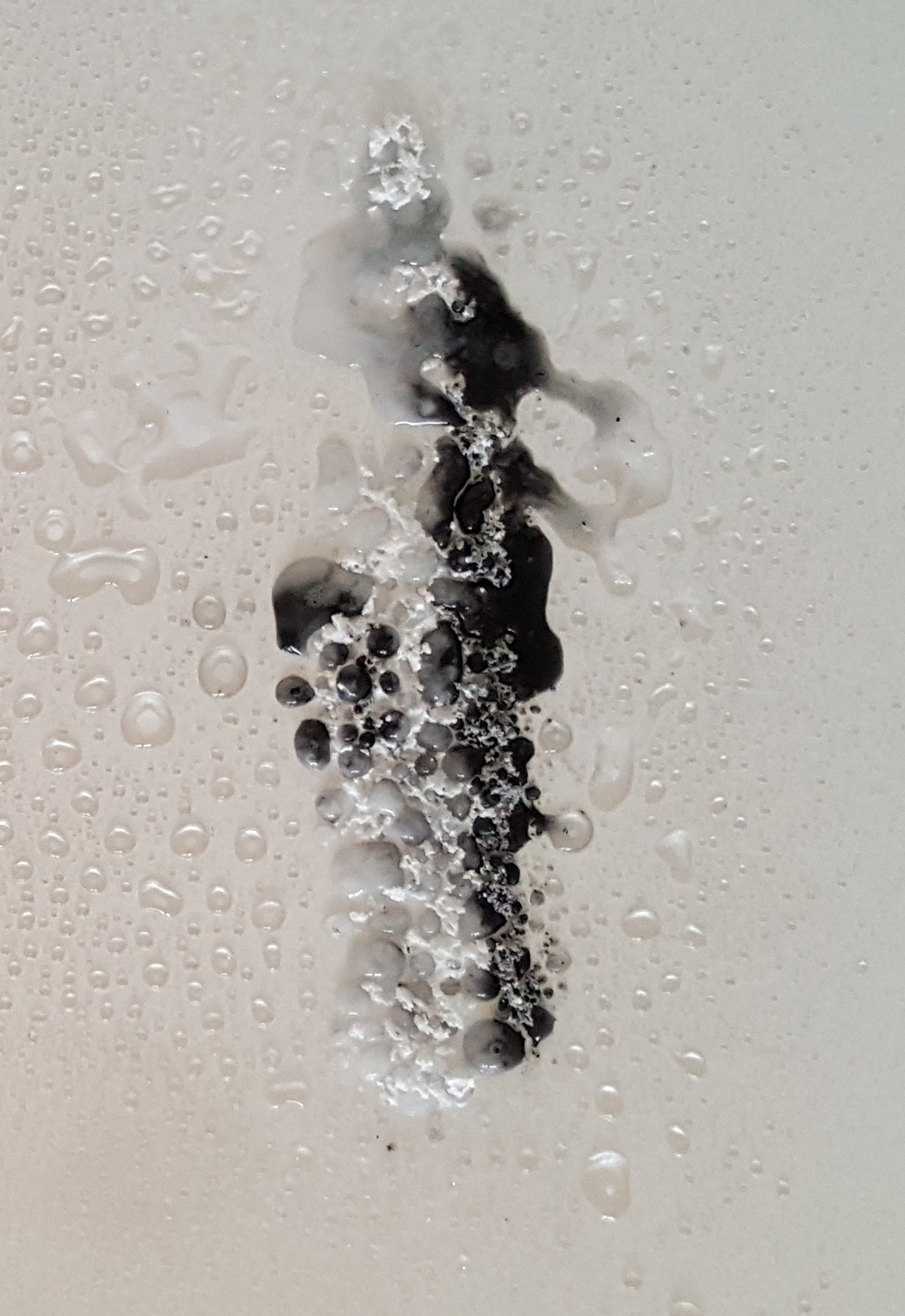

I drew the collection pushing icing sugar into the shapes and the shadows, brushing off any residual specs, but when I sprayed, the charcoal sugar went too dark for my liking.

I made two more lines on paper with two different strengths of charcoal mix to see which the best was.


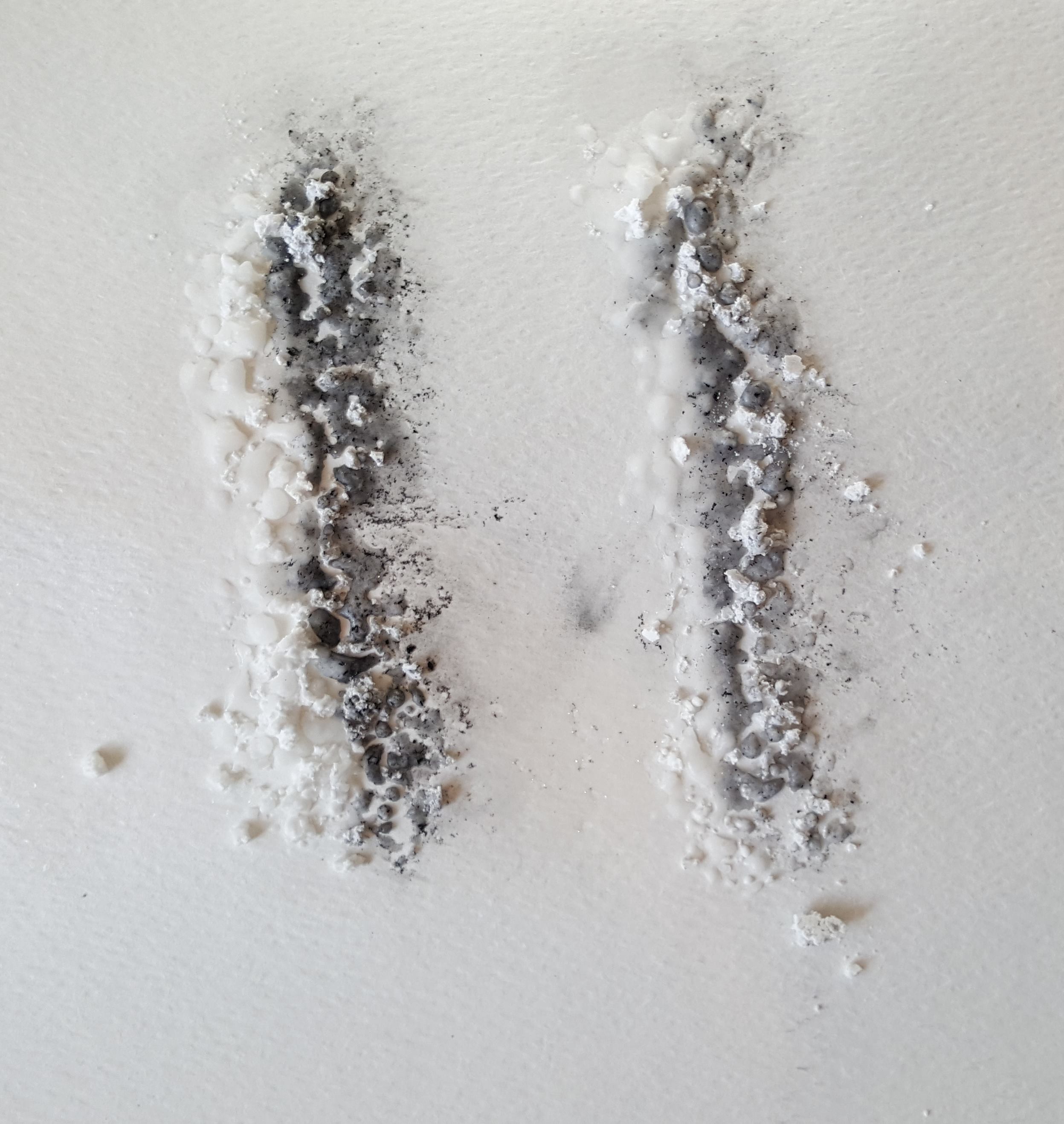


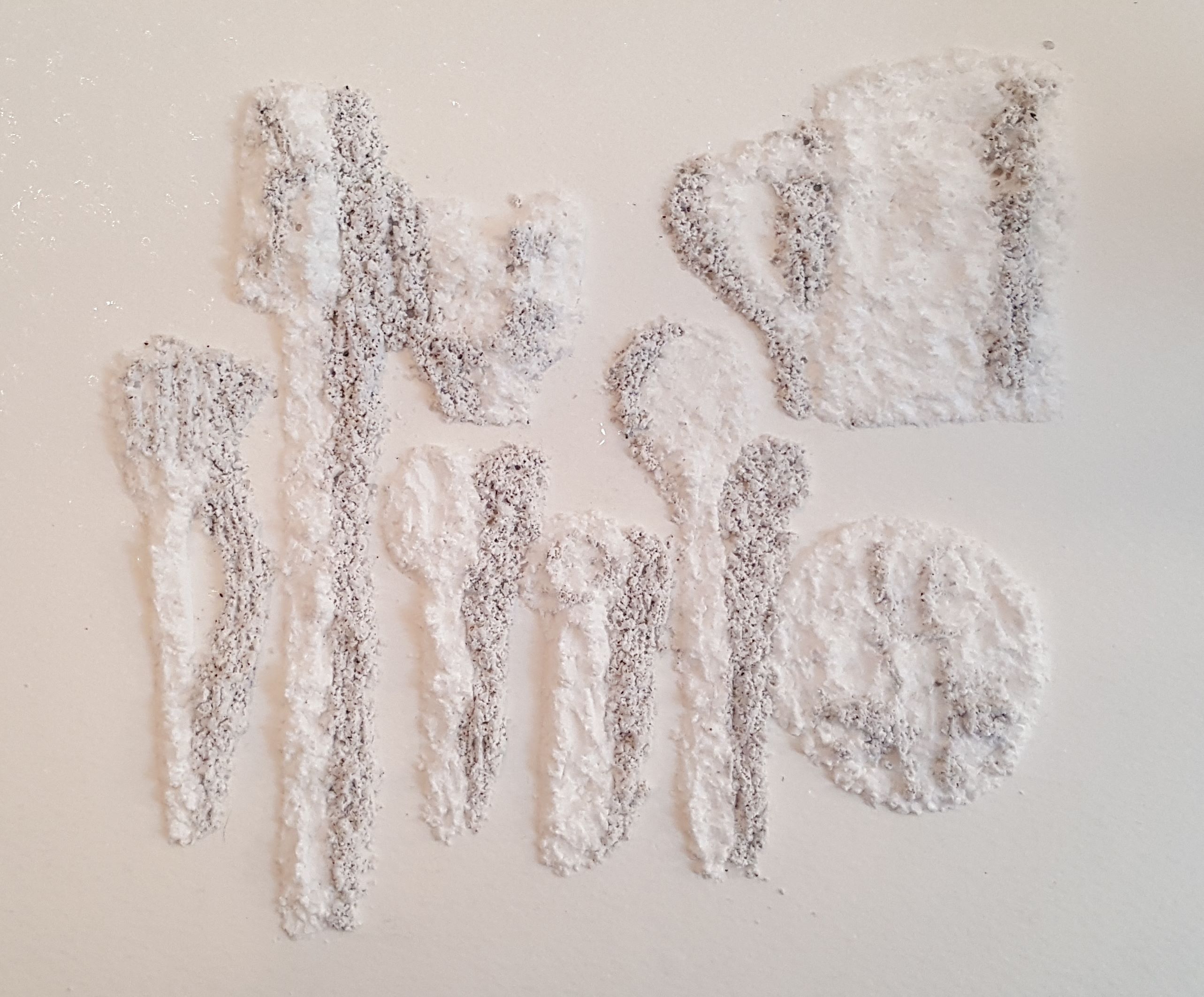
I re-drew the collection using a lighter mix of charcoal and sugar and carefully sprayed photographing each stage.


I repeated the exercise using watercolour paper.


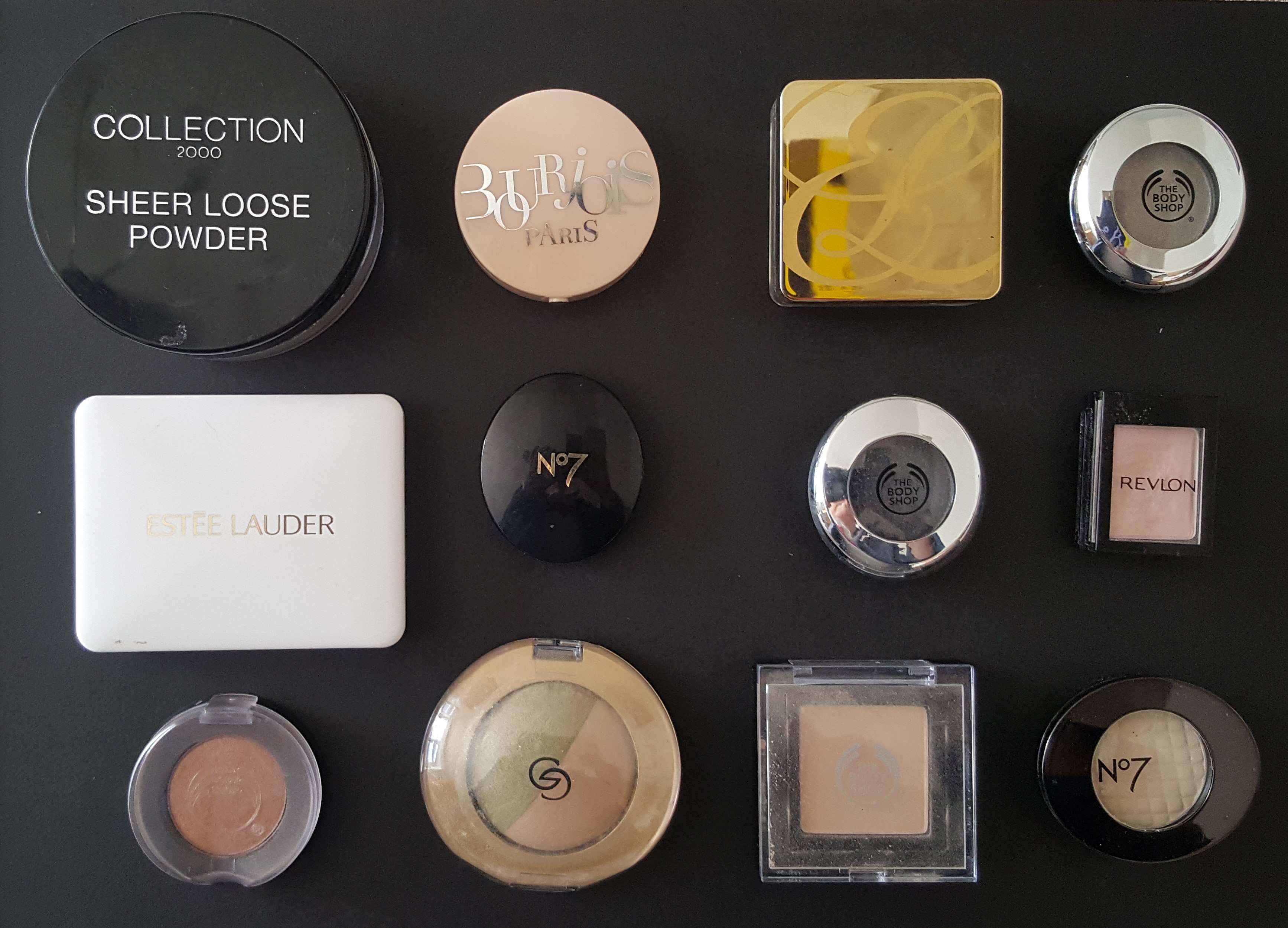
Make up collection and jam
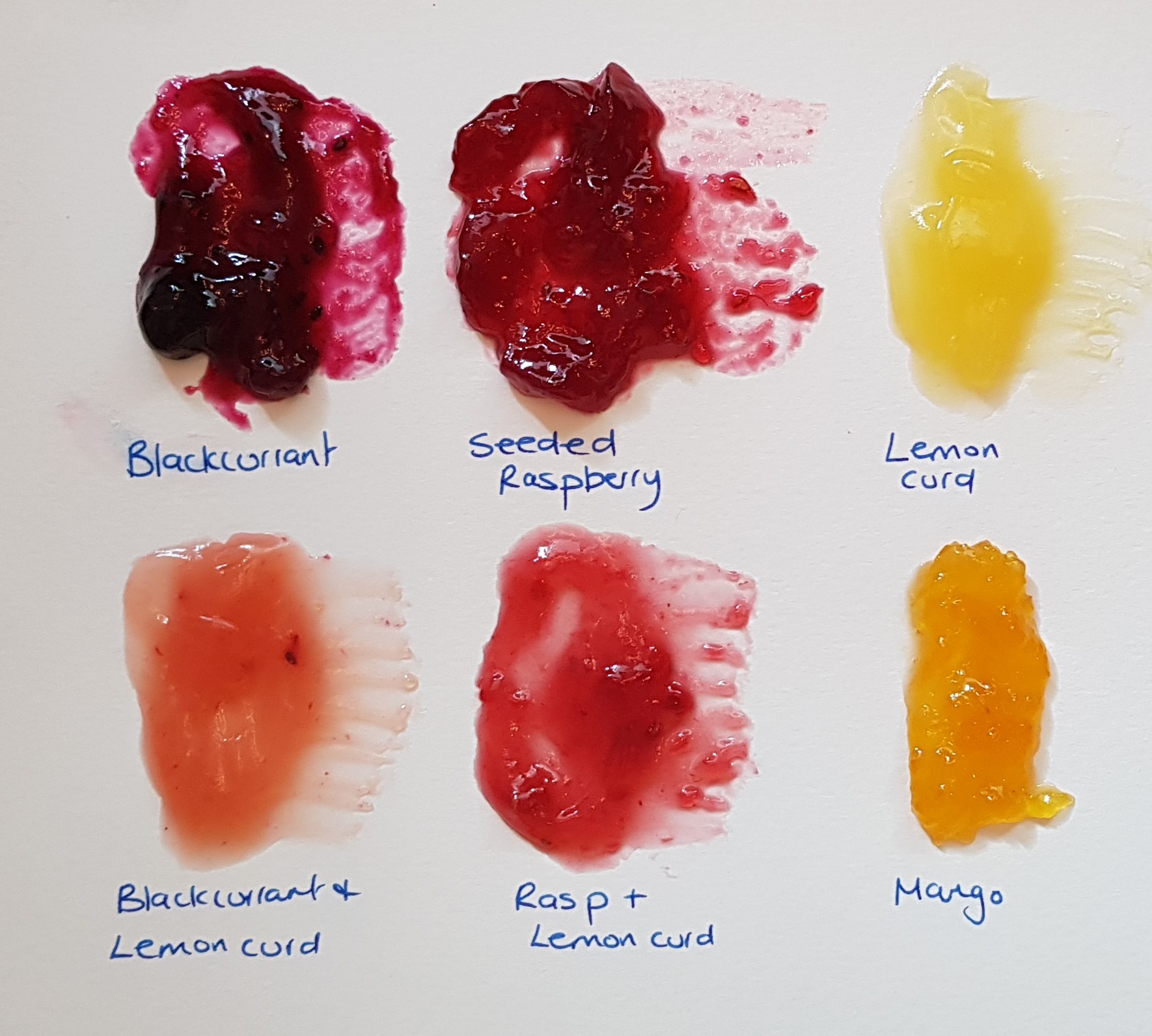
First, I made test swatch of the jam to get a feel for the texture and structure. I mixed different jams together to get different colours. The shiny jam and the pinky/orange colours suggested painting the make-up. I used acetate to squish the jam which smoothed out the lumpy jam and ‘diluted’ the colours. I ripped off the acetate which gave the jam a different texture. I pressed the acetate onto a blank sheet which produced some lovey shapes and colours. Removing the acetate made a textured jam print.


Using similar tones and colours, I created a painting of the make-up and used the same process as above to create a series of textured paintings.


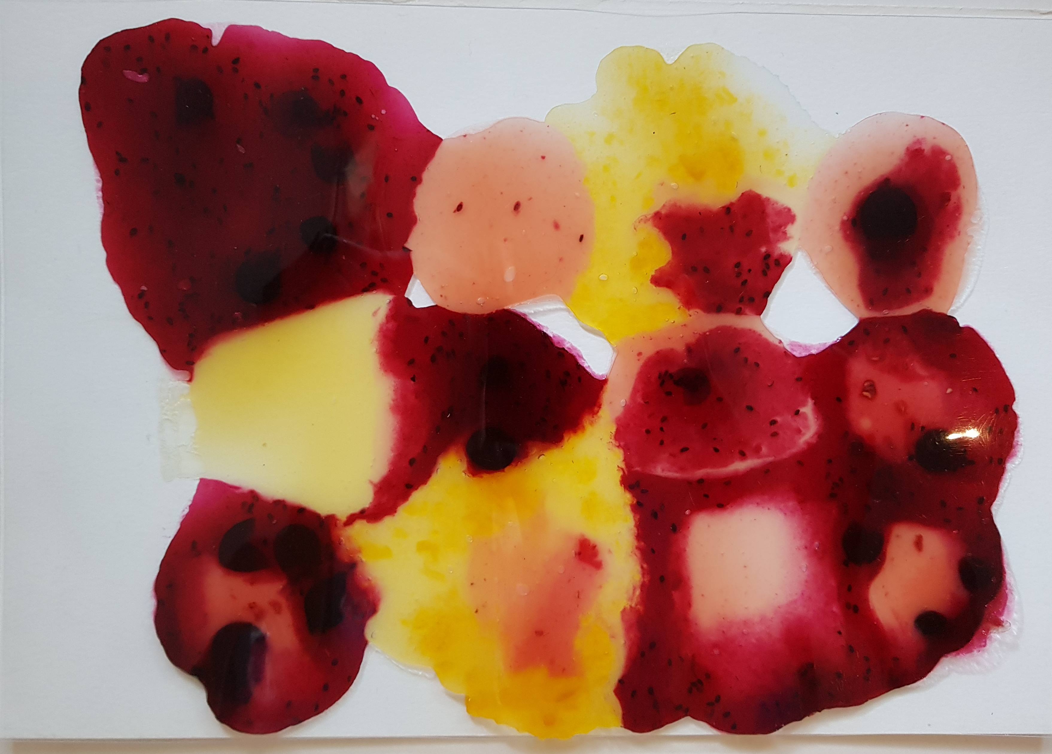
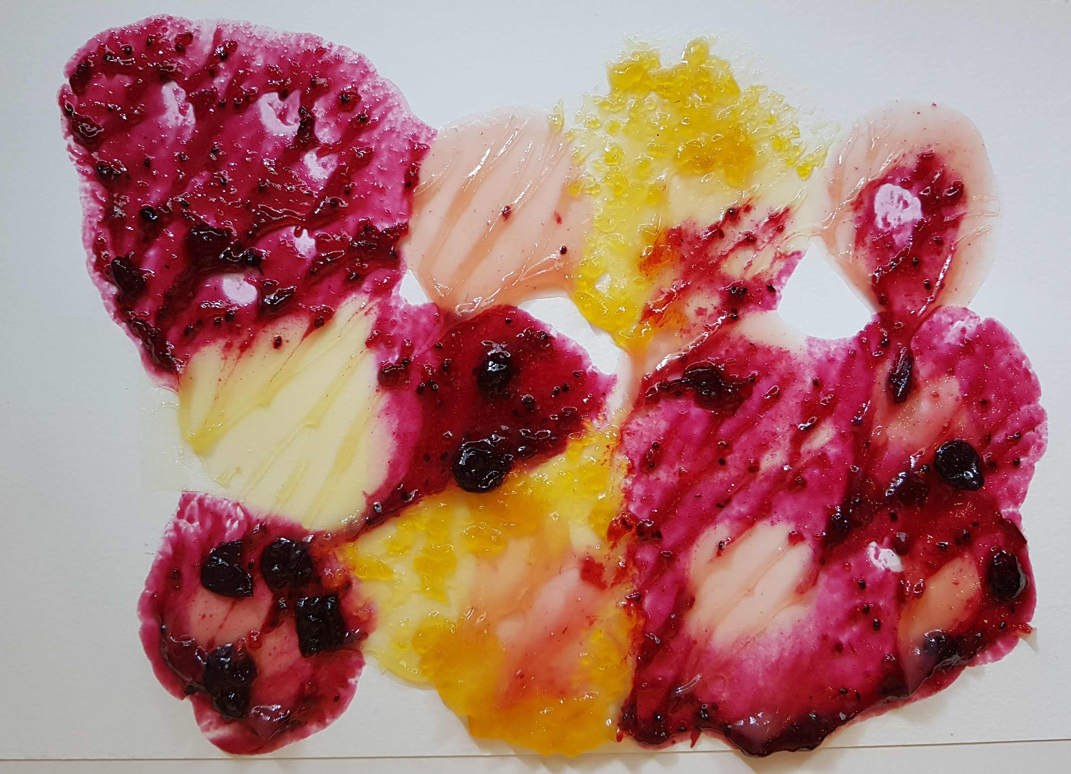


I repeated the same process on a black ground. I was amazed at the difference in the texture. The black reflected through the jam giving it a completely different effect from the white ground. As I took photos, I shifter slightly and camera picked up a different light, giving the jam a gold colouring.


Out of all the jam paintings the most visually successful are the one that have the strong vein marks. Some of them look like winter trees or veins of a heart. They look quite powerful and almost as if the marks were intended rather than by chance.
Dress collection and coloured ice
For this set of paintings, I mixed water with poster paint before freezing so I could create coloured ice to draw with. Once the ice had frozen, I finely crushed it in a food processor to make it malleable to work with. The dress collection seemed best suited to this medium because of the block colours. I decided to video the ice melting, so I made a light box that would support my camera to capture the process.


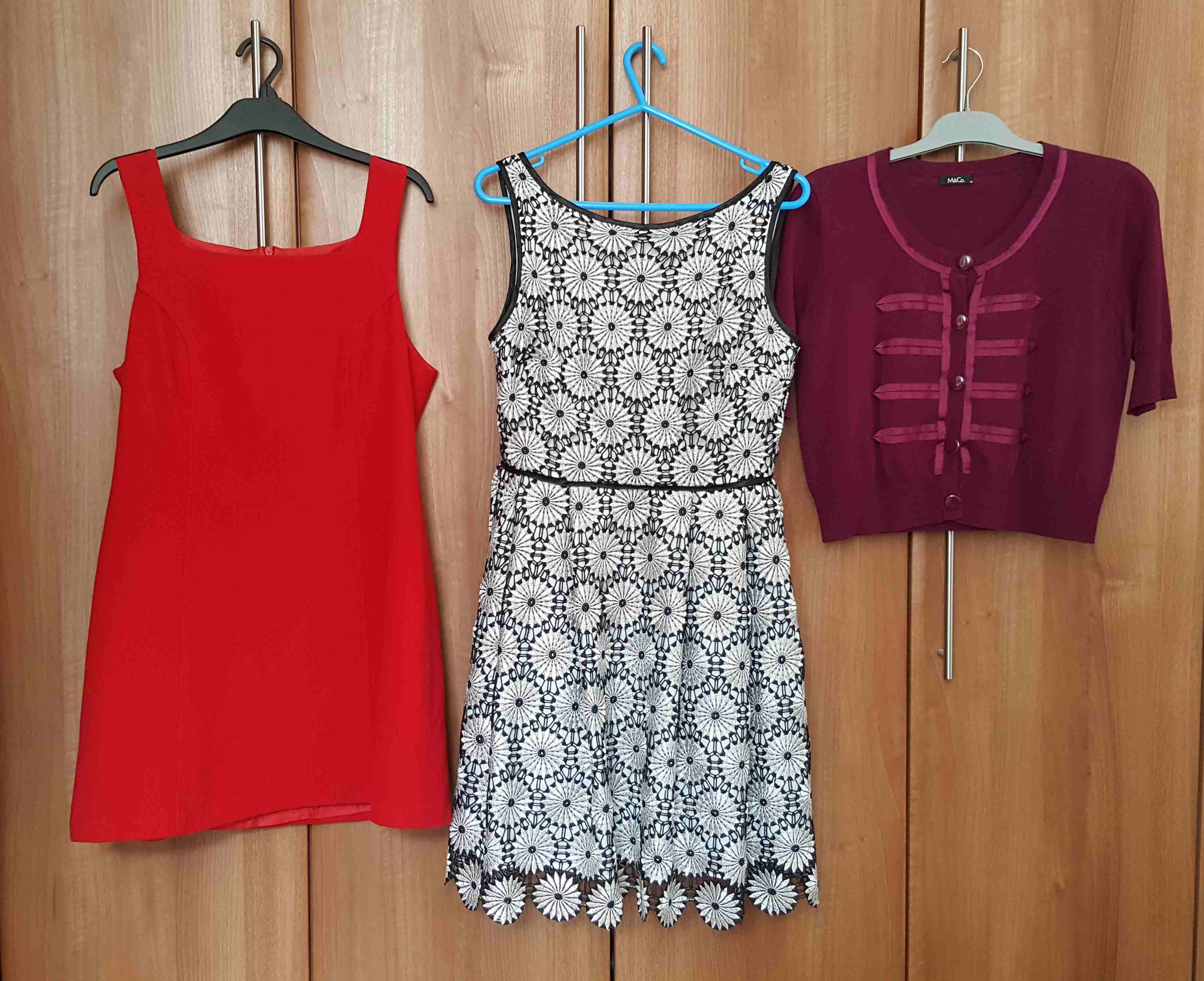
Using white watercolour paper, I quickly drew shapes of the dresses and filmed the ice melting.
Video 1: Coloured ice melt


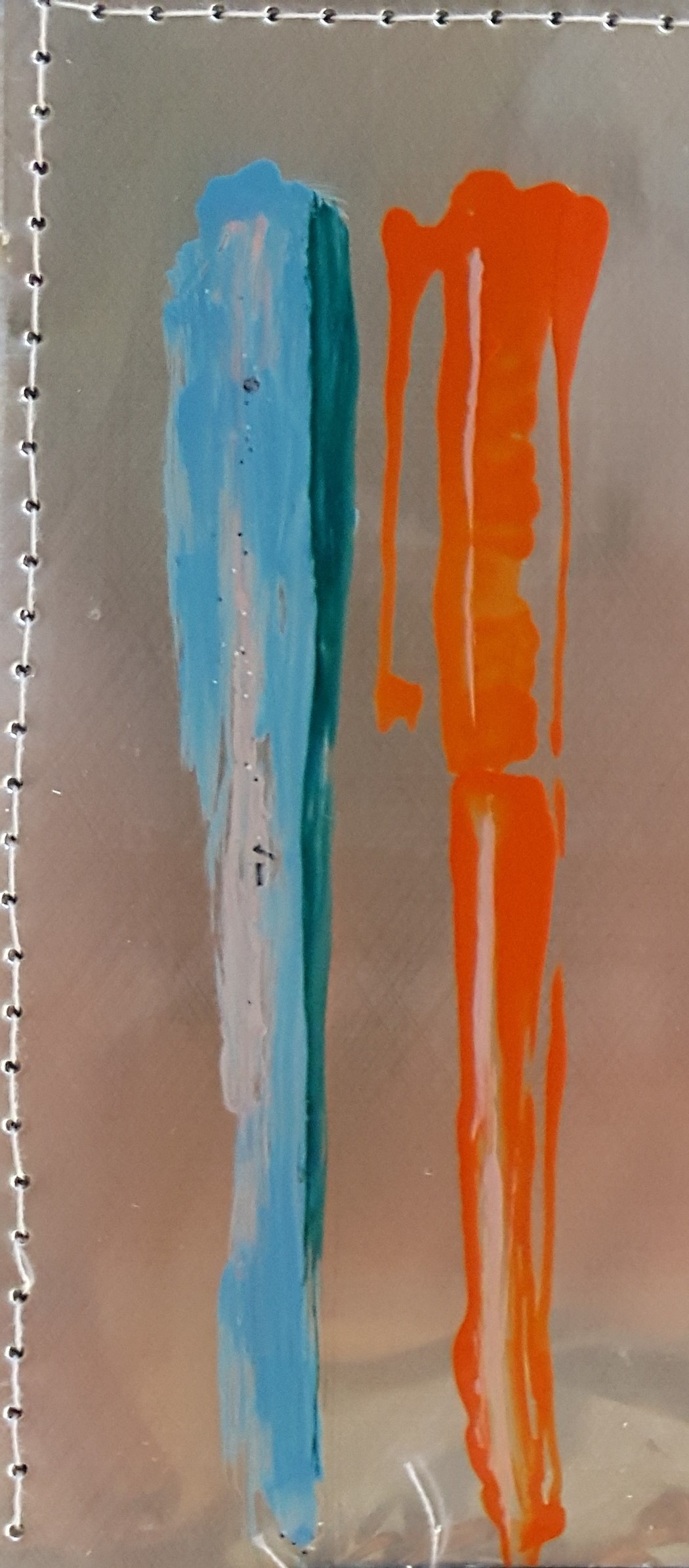
This was a super exercise to see how the ice affected the paint and vice versa. The properties of the paint changed, the white paint became quite thick with the other colours staying quite thin. I was surprised to see that there was very little mixing, the colours ran off the support in little rivulets.
Spoons collection and plain ice
I made a ground using Quink ink. I like the colour properties of black Quink ink, pigments are released when mixed or used with with a variety of liquids, for example, bleach or water. I froze plain water and crushed in the food processor.


The spoons collection seemed the most appropriate as the spoons were all the same colour. I drew the spoons with the ice which melted very quickly. It had started to melt and affect the ground before I had finished the drawing. I filmed the ice melting which shows some lovely effects between the water and the Quink ink.
Video 2a: Plain ice melt
The resulting final painting has mainly brought the blues out of the ink. There is a linear pattern similar to the way I laid out the ice on the paper.


Re-work of video following tutor feedback
Video 2b: Plain ice melt
After feedback from my tutor, where we discussed how slowing down a video can benefit the visual experience, I slowed the video down. By doing this, the viewer can see the detail of the ice actually melting without it being to slow so as to be boring.
Pens and nail varnish on aluminium drinks can
For my final experiment, I split open a drinks can to create a metal support to paint with nail varnish.
The drinks can refused to lay flat so I stitched it to a piece of cotton canvas, stuck it to a piece of mountboard with carpet tape and although it defied gravity, more or less remained flat. I tested the nail varnish on the metal support and it seemed to stick to the support OK.
I made up an A4 support with the stitched drinks can and worked the full collection using nail varnish. This was quite experimental as the nail varnish dried relatively quickly. I was unable to blend colours, so I had to think about working using block, single colours and overpainting with low/highlights. I quite liked the effect of this, that the ground shows through the varnish. It wasn’t easy to do and the mark making was quite limited.

I then tested the nail varnish on a black gouache ground, the nail varnish reacted well and I was quite excited about the marks but wasn’t keen on the texture.

I then painted the full collection on black gouache ground on a less textured paper. The colours popped and It was fun to use the limited colours I had to pick out the highlights. I havd to use a bit of imagination to work the darker coloured pens using the darkest colours I had. Overall I am very pleased with the outcome of this painting .

List of Illustrations
Figure 1 to 60: Authors own work.
Video 1 & 2: Authors own work.
